Why Piezography?
What’s the idea behind Piezography? Well, there are several claimed benefits: smoothest possible tonality, greatest available longevity, no metamerism, a unique photographic look that includes surface depth and tone brilliance, and significantly higher resolution and detail. For me, the main ones come from the fact that there’s less dithering. If you were to print with just the black ink (which is another B&W option on many Epson printers), to get lighter shades you need to space the dots further apart, that is to dither. With one black and one grey ink, as the old Epson 2100/2200 had, there’s less need to dither to get light tones, although in the highlights clearly there’s still a lot of dithering. The need for dithering to get lighter tones is further reduced in recent K3 Epson printers with one black and two grey inks, like the R2400, R2880, R3000, R3800, R3880 and so on.
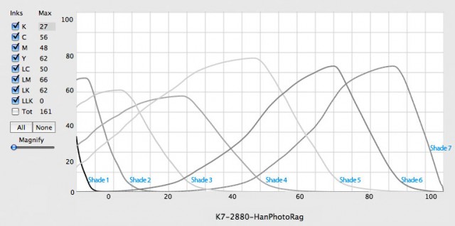
With Piezography there is one black and either five (K6) or six (K7) grey inks, so there is very little dithering. In addition, the QuadToneRIP (QTR) paper profiles (termed “curves”) have a lot of overlap between the seven ink shades, rather than relying on mostly one ink shade to print each luminosity value with minimal overlap between the inks. I think I’ve read somewhere that Jon Cone claims that this overlap means that there’s effectively no gaps between the dots on the page, just as if there wasn’t any dithering.
What this means in practice is that Piezography should be able to resolve more detail than ABW and have smoother tonal transitions. Is this true in practice? I think it’s fair to say that opinion is divided. I think so, as do many others, but equally there are prominent printers who think not.
Expert Comparisons
I think the best discussion of the pros and cons of Piezography is in this 2014 thread on the RangeFinder forum. It’s not all that long and worth a read (but ignore the pointless comparison of gloss and matte prints exchanged in a print swap between two of the participants). There are several people (Vince Lupo, Bob Michaels) who said that they had tried Piezography, but couldn’t see the benefit. I’ve spoken with a local master printer who shares that view. It’s a bit hard to argue with people who say they’ve actually tried it and didn’t see any benefit.
The really interesting section of this thread is the latter third, and the exchange between Jeff Hughes and Calvin August (Calzone), both of whom were in a position to directly compare ABW with Piezography and saw clear benefits. Cal found that in comparison to Piezography, ABW could result in an “airbrushing effect on larger prints“. Jeff’s comment that it’s “not an earth-shattering, in-your-face thing, but consistent, nuanced difference” pretty much sums up my experience. Both Jeff and Cal agree that the benefits of Piezography become more apparent the larger you print. This is hard for me to test fully, as I’m limited to 13″ wide (329mm).
Jeff went on to say that Piezography can “differentiate the entire tonal scale” which can result in issues with deep blacks. “Which is to say, if you want that deep black, high contrast image, you have to edit for it with Piezography. You have to do it knowingly, not just arriving at it as a by-product of your printer’s limitations. The flip side is that images that benefit from a long tonal range are absolutely to die for.” There can be issues with shadow tones that can trip people up, and I say more about this in an article on workflow and ICC profiles.
Jeff Hughes has written a lengthy blog post about his Piezography journey, and another Jeff – noted landscape photographer Jeff Grant – has also published his experiences with Piezography.
Making Comparisons
Surely you can solve this by printing on each and comparing? Well that’s what Jeff Hughes and Cal seem to have done, and they favoured Piezography over ABW. I’ve tried it too, although not usually in such large sizes. With smaller prints the difference is a little harder to see, and it varies from image to image. There are blog posts elsewhere, that you can readily find by searching, which purport to show that QTR is better than ABW, but I’m not convinced that the comparison is entirely fair.
The real obstacle in my view is getting an apples with apples comparison. That is, I find that I need to edit the image differently when printing ABW and Piezography. Piezography curves are created to be linear in Gamma 2.2, whereas ABW is rarely linear, because it seems Epson haven’t designed it that way. So I use soft-proofing ICCs to try to match the prints, but a direct comparison remains elusive. An image edited for ABW won’t generally look as good when printed using Piezography, and conversely. That said, my view is that there are subtle but noticeable improvements when printing with Piezography.
At least that’s on matte paper. On gloss, things are not so clear. ABW has some advantages on gloss, delivering a higher dmax than Piezography, and not needing a second Gloss Optimiser (GO) overcoat to remove gloss differential and bronzing (although GO doesn’t do any harm to an ABW print, and may be beneficial). Nonetheless Piezography still has the subtle and nuanced improvements that Jeff Hughes noted, and its capacity to “open up the shadows” can be even more important for some gloss prints. So the choice for gloss is not so clear-cut.
The Type of Image
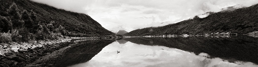
So the two big advantages are detail and tonal transitions. For me, it’s the transitions. Using Piezography has changed my own personal preference for what sort of image I prefer to print. Like many people in the digital age, I initially developed a preference for images that pop. Lots of contrast. I think that on-screen editing reinforces this preference, as does printing on gloss papers. However over the time that I’ve been working with Piezography, and learnt to appreciate subtlety and transitions, I’ve developed a taste for images with a good range of mid-tones. I still want some good, deep shadows to anchor the image, and ditto for the highlights, but that’s an anchor and not where the image draws its power. If you have an image with lots of deep shadow detail, then with some effort and care in editing Piezography can help to open the shadows and resolve the detail. But for me, the action has shifted to the mid-tones.
Cost
The issue of “worth the trouble” also raises issues of cost. If you want to print colour as well as Piezography then you’re going to need a second printer. That’s a substantial cost, although if you can live with 13″ wide as a limitation then the R2000, currently on run-out with a cash-back, is an excellent choice for either K7 or P2 (K6) Piezography, and the R1430 is another good choice if you only want to print matte and don’t mind K6 rather than K7.
Piezography inks are $US0.37 / ml in 220ml single bottles, or slightly cheaper in complete sets. Even at the $AUD/$US current exchange rate, this is cheaper than Epson inks in small to medium cartridge sizes. You need to be using a large format printer with 220ml cartridge sizes to get a per ml ink cost for Epson inks this low. So I don’t consider Piezography inks to be expensive. That said, Piezography will usually lay down more ink on the page, having an overall higher ink load, so it may use more ink. I’ve not seen a comparison of the cost of printing a page using Piezography with using Epson inks.
There is another potential cost, which is custom curves. Unlike using QTR with Epson inks, where you can create your own curves, Piezography curves are created by Inkjetmall, and are hard to edit or refine, at least directly. QTR comes with a range of Piezography curves for common matte papers and Inkjetmall has downloadable curves for some but not all gloss papers. If you need a different curve, sometimes Inkjetmall can supply one, otherwise you need to purchase one for $US99. More recently the creator of QTR, Roy Harrington, has created a small “droplet” application that will “re-linearise” an existing curve, and this can be used to adapt a curve for one paper to a similar, alternative paper (see the separate advanced article on using the droplet). This should greatly reduce the need for custom curves, although the “droplet” does have its limitations, and to make use of it, you’ll need a measurement device.
Overall, and other than the need for a second printer, I don’t find Piezography expensive compared to ABW using Epson inks. Of course it is more expensive than third-party colour inks and also than alternative monochrome inksets like Eboni-6.
| Last: Where Does Piezography Fit In? | Next: Printer and Inkset Selection |