This is an article about workflow – the sequence of steps used in making a Piezography print – with particular emphasis on the colour management aspects. In the first section I describe what I term the “orthodox” workflow, which may assist new Piezography users understand the process, as key aspects of the standard QuadToneRIP (QTR) workflow are not well-explained in the New Piezography Manual (28 August 2013 edition).
The rest of this article is intended for experienced users as it deals with alternative “heretical” workflows. I’ve tried to make it as simple and straight-forward as possible, so if you’re a new user and feeling brave, then good luck. Just keep in mind that some of the adjectives and colourful phrases in this article are used tongue-in-cheek. And that this article is now several years old – the world has changed somewhat with the release of the Piezography Pro Toolset (see the last section below) and a more recent Piezography manual than the one referred to here.
The Orthodoxy
I assume you have either created or been given an ICC profile generated by QTR corresponding to the Piezography QTR curve that you’re printing with. The image you wish to print is supposed to be in Grey Gamma 2.2, so convert it from whichever colour space it’s in into Grey Gamma 2.2, edit it with the aid of a soft-proof to achieve the image you want, and print. Do not print using the ICC profile. In Windows you use QuadToneRIP GUI (QTRGui) to print. In Mac OS X you print using a companion program to QTR, Print Tool, as since Mac OS X 10.6.8 you can no longer print direct to QTR from Photoshop and retain full control over colour management.
Under this workflow, soft-proofing is a little different. We’re not printing using the ICC profile, so when you select “View | Proof Setup | Custom …” in Photoshop, you must check the option “Preserve Numbers”, which shows you what your print will look like if printed exactly as-is in Grey Gamma 2.2, rather than using the ICC. This is the orthodox approach. (The “convert or not to convert” in the title of this article refers to printing using the ICC. In Print Tool on OS X you’d specify the ICC as part of the print process, and the conversion to the ICC would happen on-the-fly. On Windows, since QTRGui can’t do this, you need to do the conversion to the ICC manually in Photoshop and save a converted copy and print that via QTRGui.)
For an image in Grey Gamma 2.2, the difference between a preserve-numbers soft-proof on and off (simulating printing using the ICC or not) will depend on the image. For an image with deep shadows they will appear lighter in the soft-proof. This is not true for all images, the difference for high-key images, for example, will be negligible to none. The difference is much more marked for matte papers than gloss/baryta. However in an image with substantial shadow tones, and especially deep shadow detail, you most definitely will notice the difference for matte papers.
To see the effect most clearly, it may help to temporarily uncheck “Simulate Black Ink” and “Simulate Paper Colour” in your soft-proof settings when doing this comparison. It will also help to get a good soft-proof if your monitor can be set to a colour temperature of 5000K (D50) and have its brightness and contrast set to match the characteristics of the paper, a process termed calibration for print.
New users who don’t realise the importance of editing using this soft-proofing approach often complain about light and/or flat and/or weak prints. Which is understandable, as this orthodox workflow is not all that well explained in the New Piezography Manual (2013 edition), unfortunately. Well, Grey Gamma 2.2 is mentioned quite a lot, but not the “Preserve Numbers” soft-proof setting.
Perceptual Linearity
Now anyone who has printed colour using ICC colour profiles will be wondering why on earth don’t we print using the ICC, just as we do for colour?
Well, you can, but you risk being burnt at the stake as a heretic. Let me explain. The ICCs generated by the QTR ICC profile creation tools have been designed to provide “perceptual linearity”. If you want to understand what this means, read this post by QTR creator Roy Harrington. My short summary is that they result in a better screen-to-print match if you use them for printing, although there’s more to it than that. In order to achieve this, using the ICC to print will seriously compress shadow detail. Will shadow detail get lost? In an image that has any significant shadow detail, yes. This is what will get you burned at the stake.
Printing an image in Grey Gamma 2.2 as-is via QTR without using the ICC profile will result in more open shadows and more shadow detail – more than what you see on the screen (without a preserve numbers soft-proof). Printing using the ICC profile will have the opposite effect. There was a fairly heated debate about this some years ago – see here and here if you’re interested, but you’ll need to read the entirety of these two threads.
To get some idea of the effect of printing using an ICC or not, here is a comparison of linearisation plots from the two approaches. For those not familiar with this concept, to create a linearisation plot, use the applicable QTR curve for the paper in question to print a standard 21×4 test chart, which looks like this:
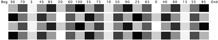
then measure the printed chart using an i1 Photo or similar, process the results through QTR-Linearize-Data, and plot the luminosity column from the output in a spreadsheet (there’s a little more detail on this process in the Re-linearising A Piezography Curve article). The ideal result looks like this:
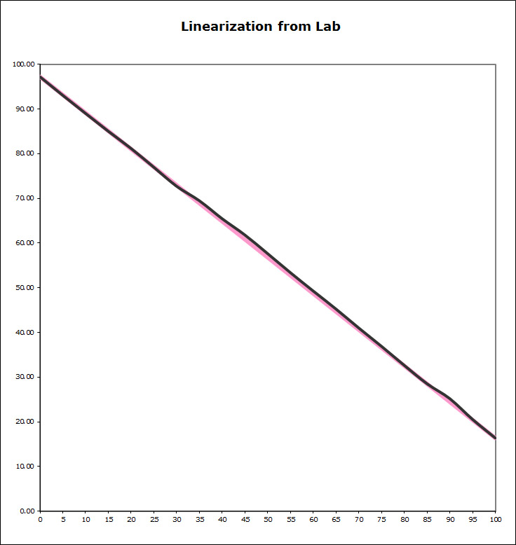
In the above chart, the vertical axis measures luminosity and the the horizontal axis measures the density of the patch, with 0 being white and the 100 being black. The pink line plots the ideal numbers and the black the measurement results. In this case, the luminosity values are very close to the ideal straight line, which is why Piezography is described by its creator as “linear in Gamma 2.2”, which I interpret to really means “linear in luminosity” and printed in Grey Gamma 2.2. It’s not just Piezography that has this property – any QTR curve that is linear will fit this description if the image is printed in Grey Gamma 2.2.
To demonstrate the effect of printing using an ICC, I assigned the untagged 21×4 TIFF file to Grey Gamma 2.2, printed using the ICC (something you’d otherwise never do to the 21×4), and measured. Here is the linearisation plot, and you can see the effect on the shadows:
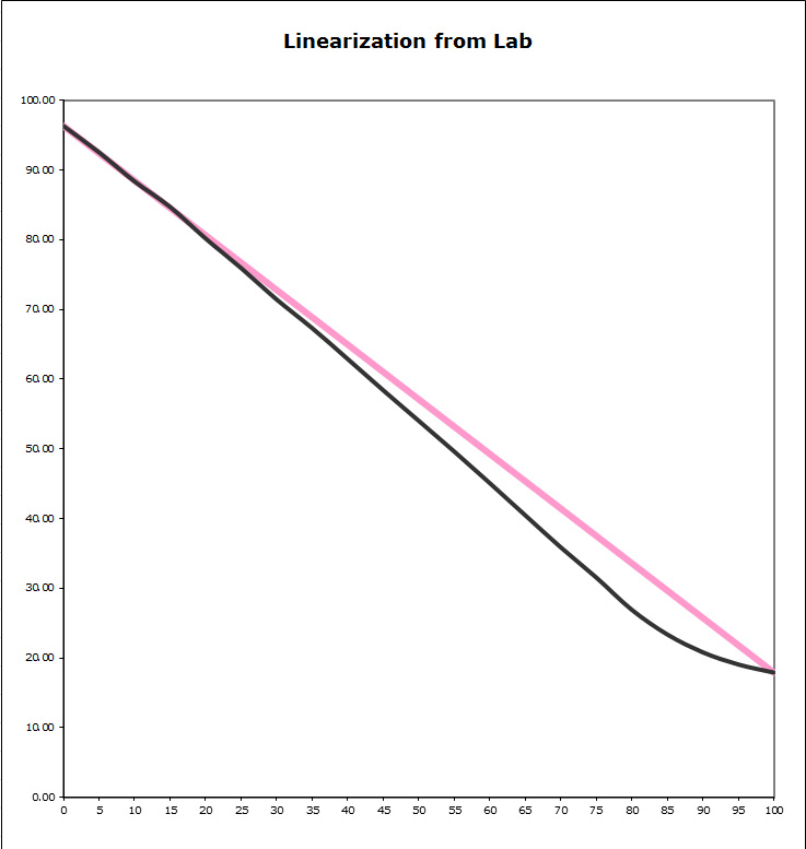
It’s linear for much of the range, in the sense that it’s a straight line, but not in the shadows, and overall it’s a fair bit darker. The rationale is that this provides a better screen-to-print match. The counter view is “but what about the shadow detail?”
The Heresy
So what’s a person to do? Well I have several ways of dealing with this. In images which don’t have a lot of shadows and shadow detail, I sometimes print using the ICC profile. But whatever you do, don’t tell anyone. I find that I get better local contrast in the shadows in such situations. But when I do choose to do this, I carefully compare versions with and without to ensure that any important detail is not lost. I also often apply a Photoshop curve to boost the shadows a little to offset the effect of using the ICC. But I only do this rarely nowadays. Mostly I now print using the hybrid or pragmatic approach below.
Being Pragmatic – A Partial ICC
I often find myself wanting to make only partial use of the ICC for printing. The image printed in Grey Gamma 2.2 is too light, but the image printed using the ICC is too dark. Where’s the middle ground? Based on a technique of Paul Roark, which uses a Photoshop curve to approximate the effect of the ICC, I created my own Photoshop curve that is the equivalent of that last linearisation plot. That is, it darkens in image in the same manner as printing with the ICC does. The advantage of using this Photoshop curve for soft-proofing and printing is that I can edit the shadows up or down to where I want them by adjusting layer opacity, with the preserve-numbers soft-proof as my guide, in effect providing a partial ICC that can be dialed in or out to taste. This is how I do a lot of QTR printing at present, the layer opacity set to something like 60-70%.
My Photoshop curve is defined using these points:
(0,0) (13,4) (26,9) (37,18) (51,29) (64,44) (102,88) (153,146) (204,202) (255,255)
Newer Approaches
Since this article was created, InkJetMall have release their Piezography Pro Toolset, at a cost of $US150 per year. Apparently it’s particularly useful if you use their Pro inkset containing both cool and warm inks. I have experience with the toolset although I have recently started using the new inks. According to this post, the toolset contains tools that enable users to create ICCs that provide a better print-to-screen match without crushing shadow detail.
| Last: Resizing and Resampling | Next: Re-linearising A Piezography Curve |